Diamond
Diamond's New Sparkle
- Brand Identity
- Brand Language
- Brand Architecture
- Packaging
The Challenge
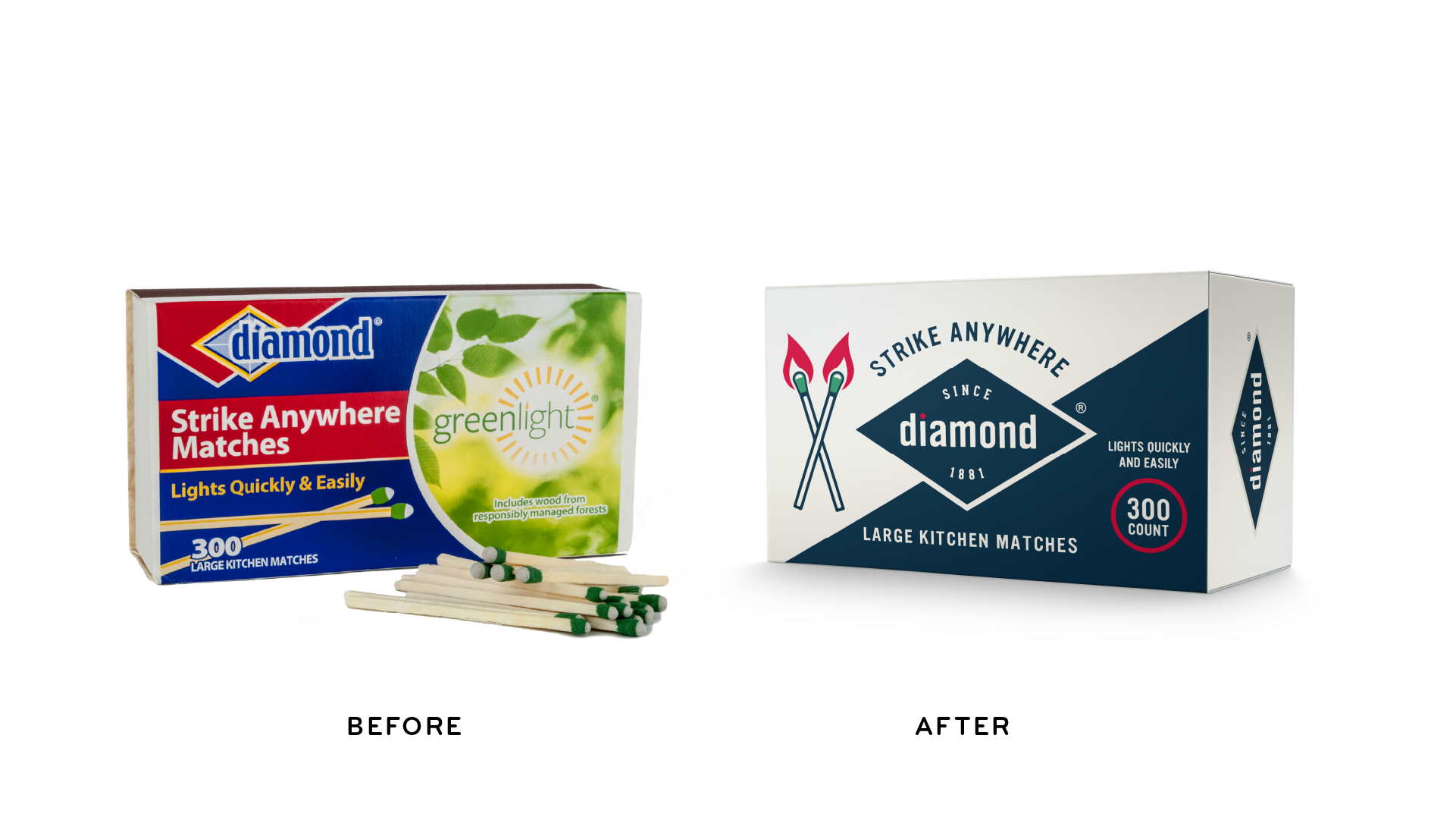
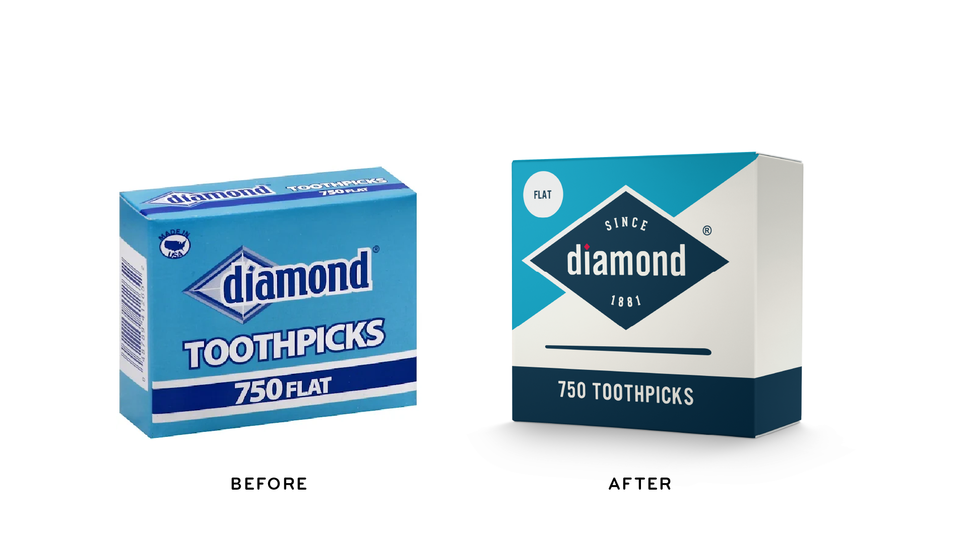
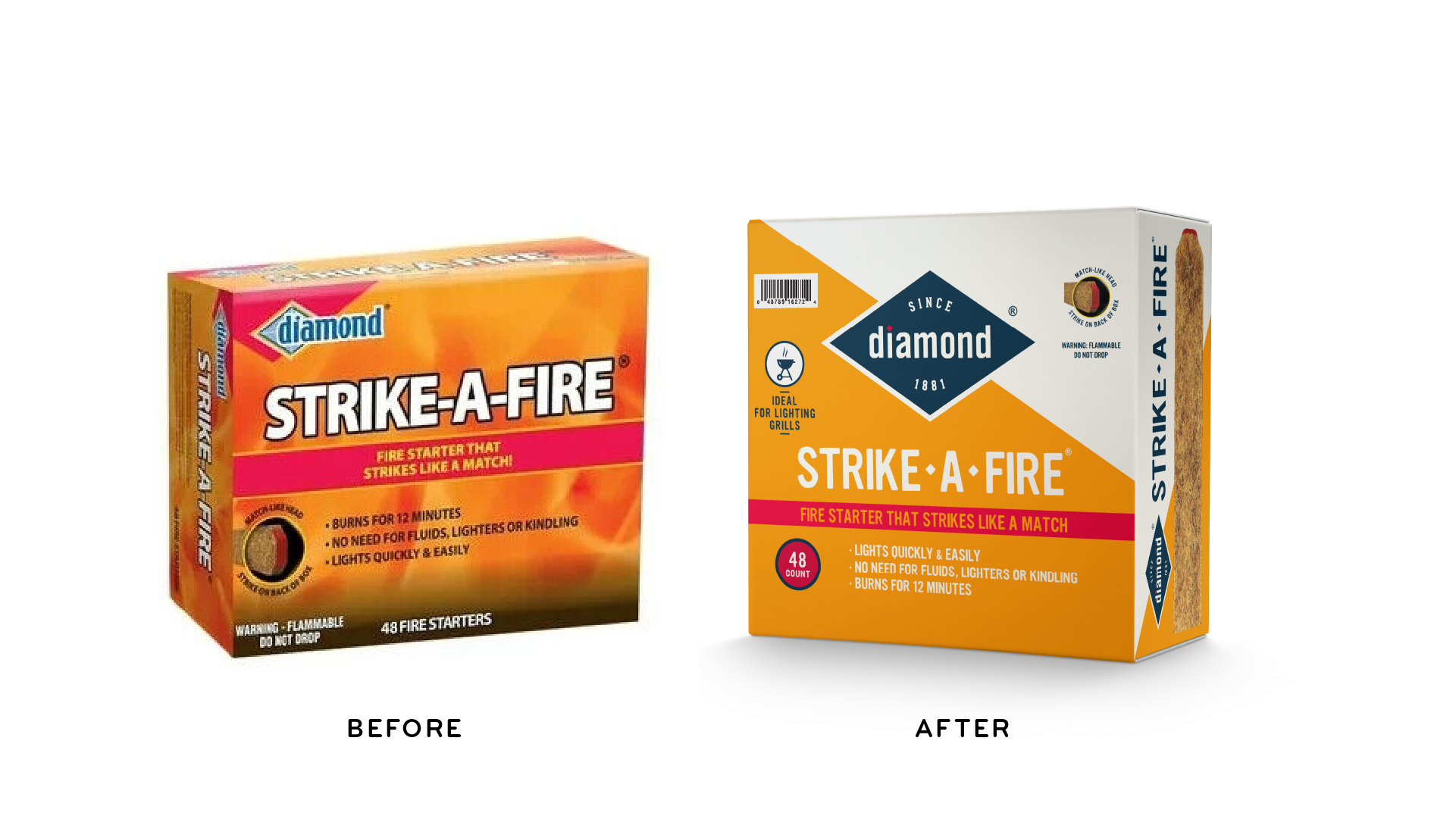
Many of us grew up with Diamond’s trusted matches sitting next to the fireplace. When we were of age, we appreciated the dependable Diamond toothpick that speared the delicious garnishes in our favorite cocktails. Since 1881 the Diamond brand has been by our collective side innovating generation after generation. Those 140 + years of innovation added up to some visual incongruencies that, over time, dulled the brand’s luster and made it difficult to navigate. Our challenge was to create a navigable framework for a vast variety of offerings while celebrating the brand’s inherent shine.
The Solution
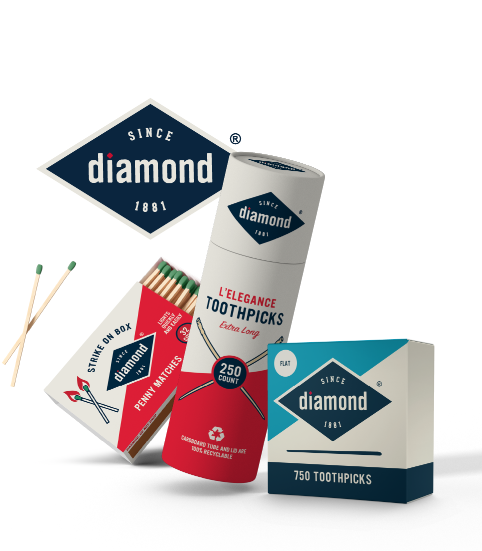
The solution: Lean on the brand’s hard earned equity by harnessing its timeless legacy and bringing forward a new premium sensibility to recognize the brand’s many innovations.
Our Approach
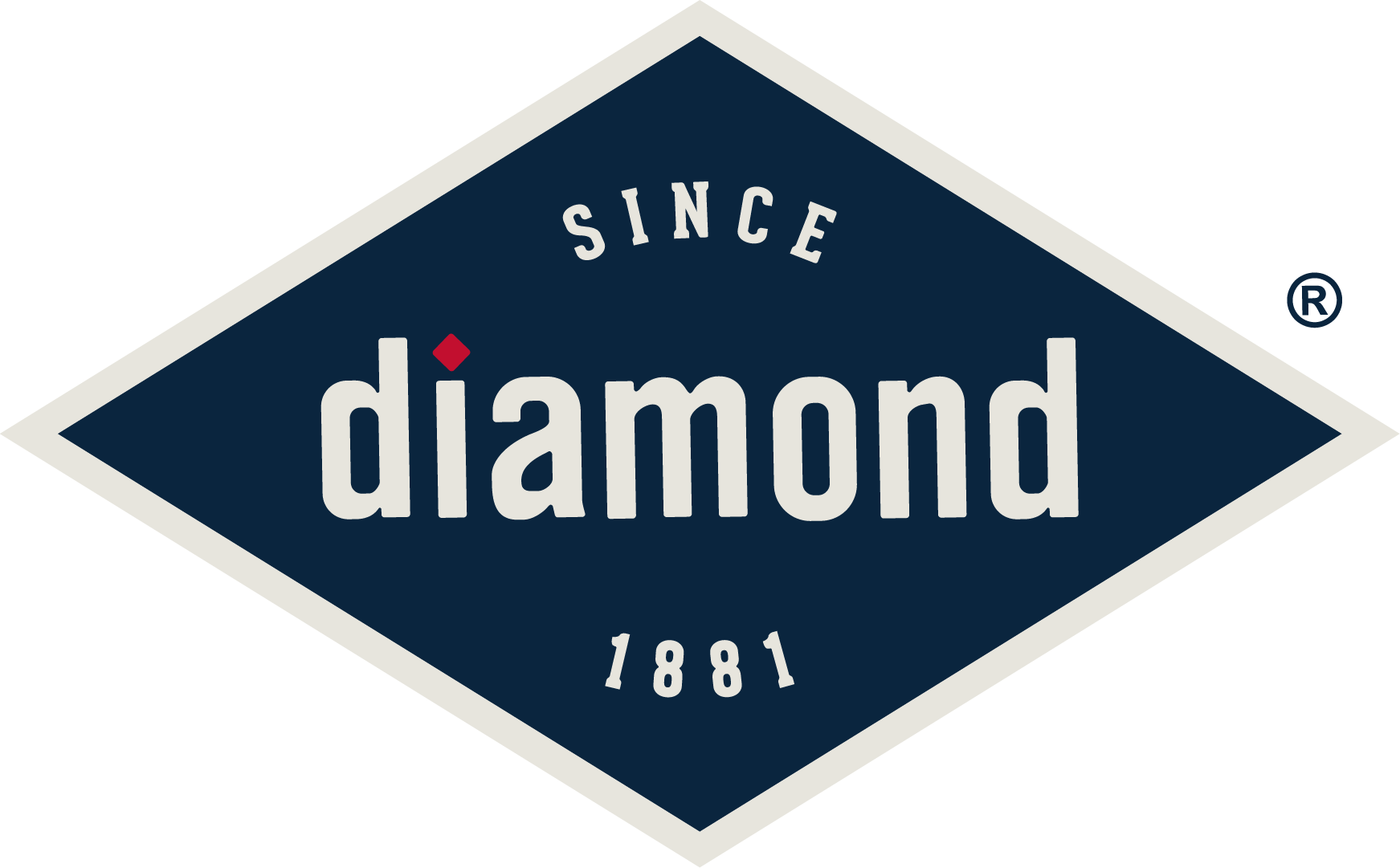
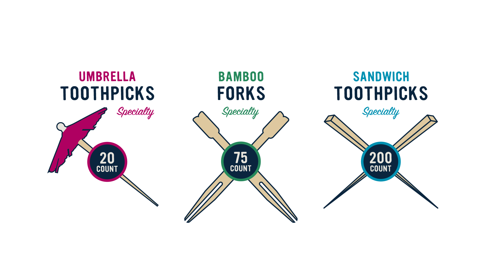
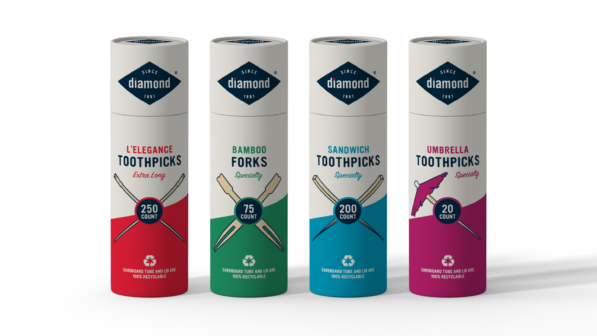
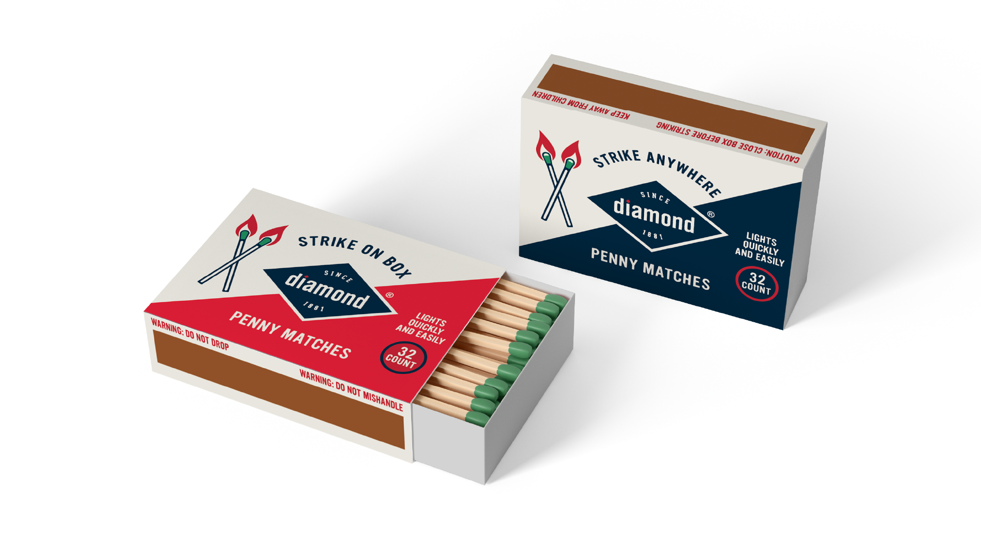
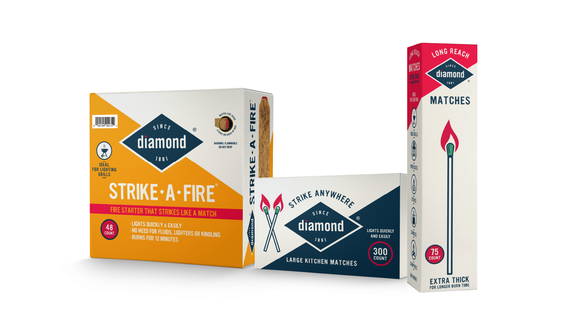
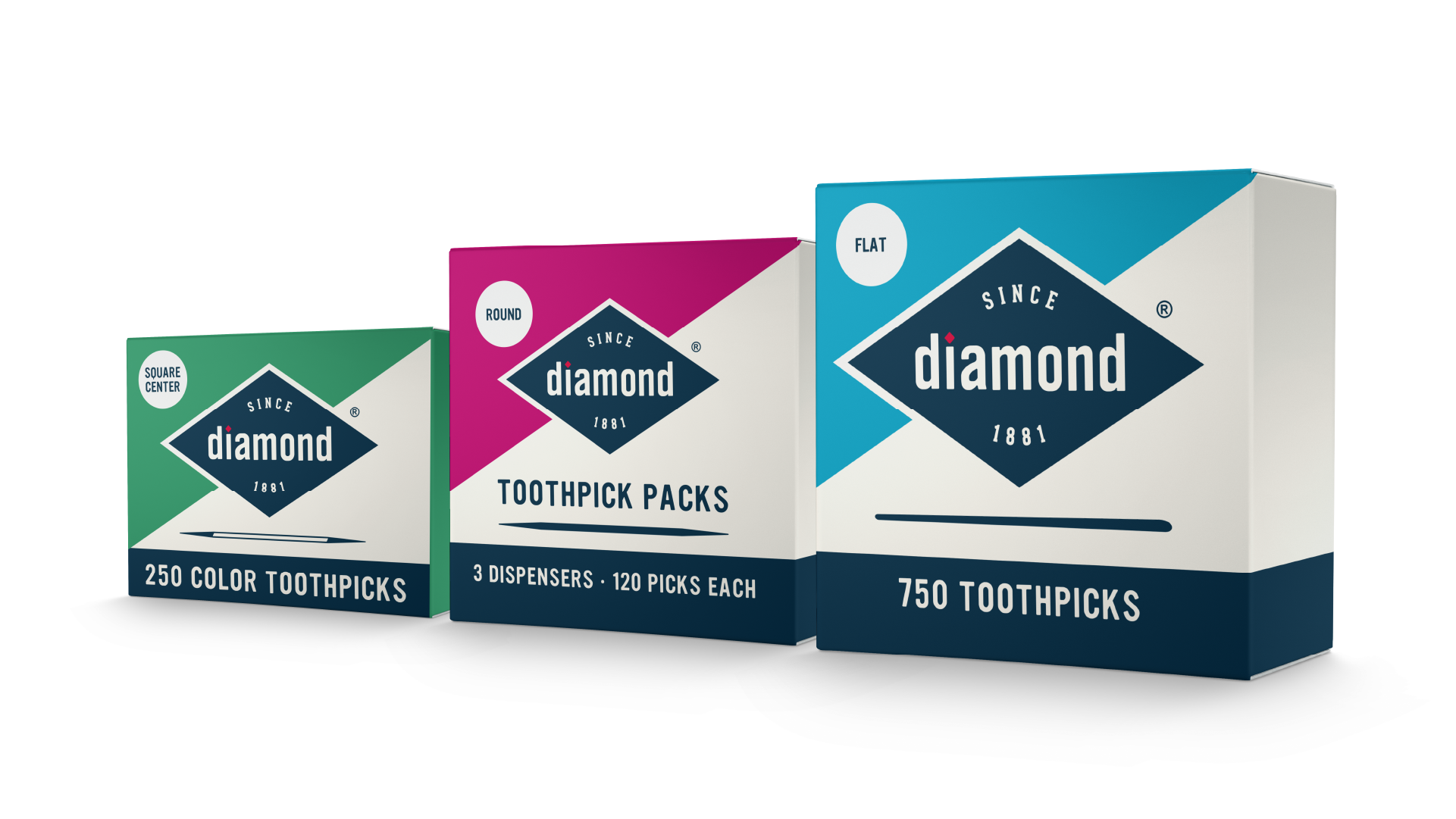
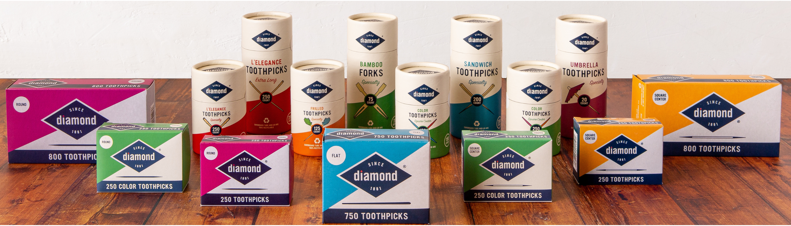
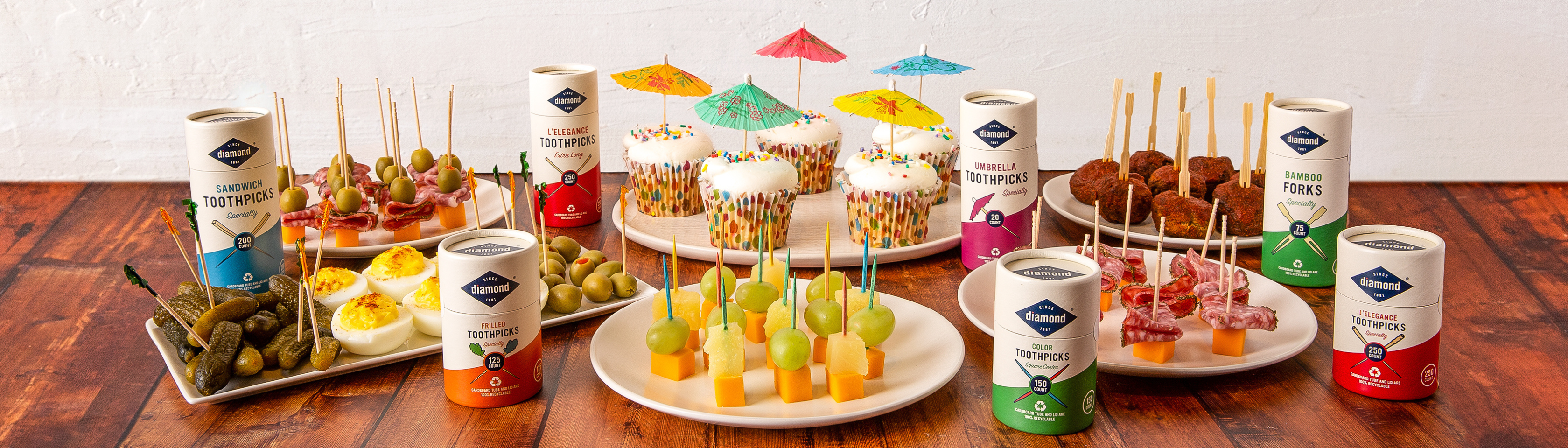
We leveraged the brand’s valuable nostalgic heritage while modernizing their primary identity to reflect Diamond’s innovative character. We contemporized the Diamond blue and added a red diamond shape to dot the Diamond “i”, all as a salute to this iconic American brand. In contrast, we created a bold and dynamic secondary color palette to distinguish the variety of product types offered in both the toothpick and match categories. By scaling the primary identity shape, the secondary color is displayed.
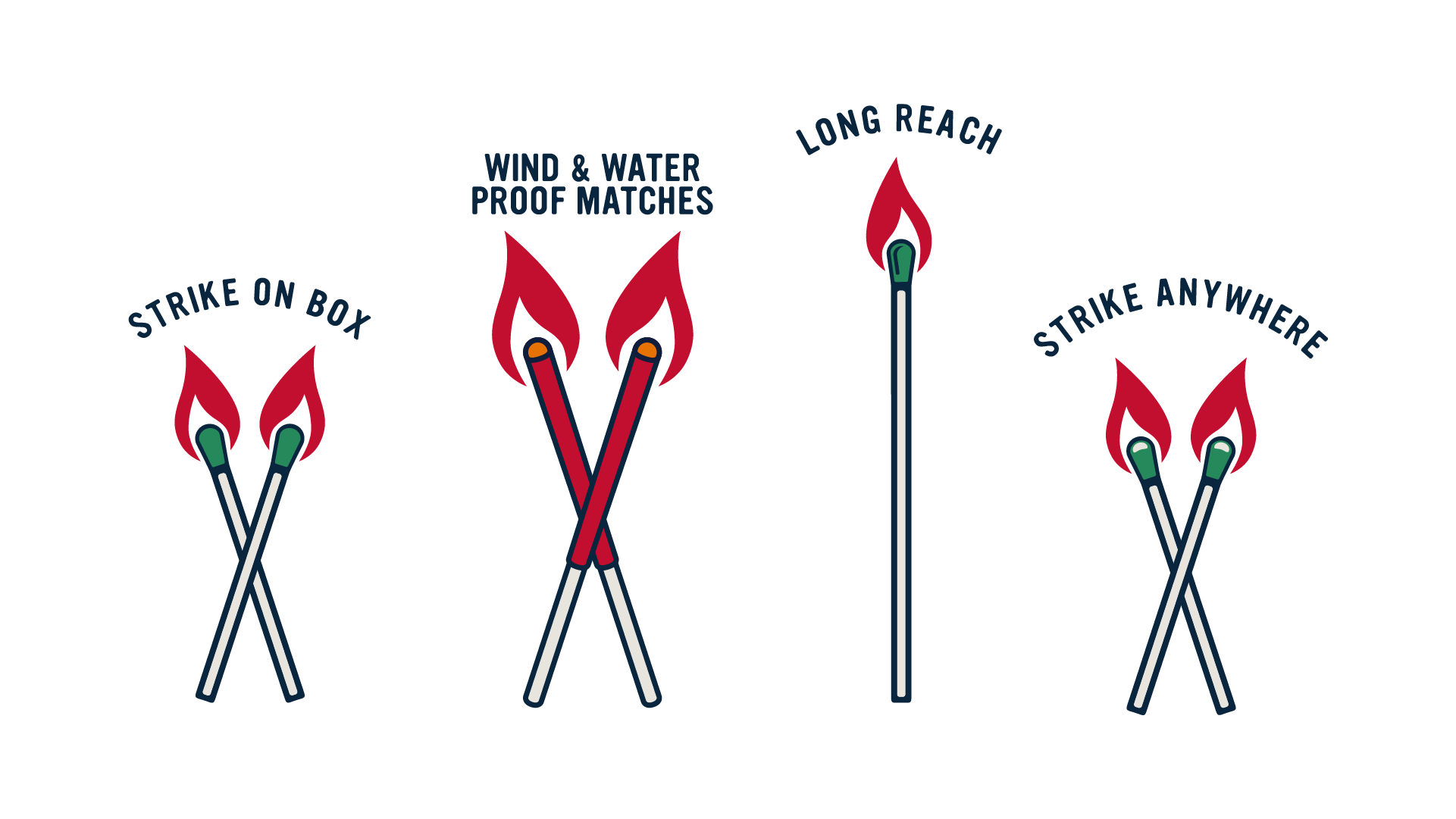
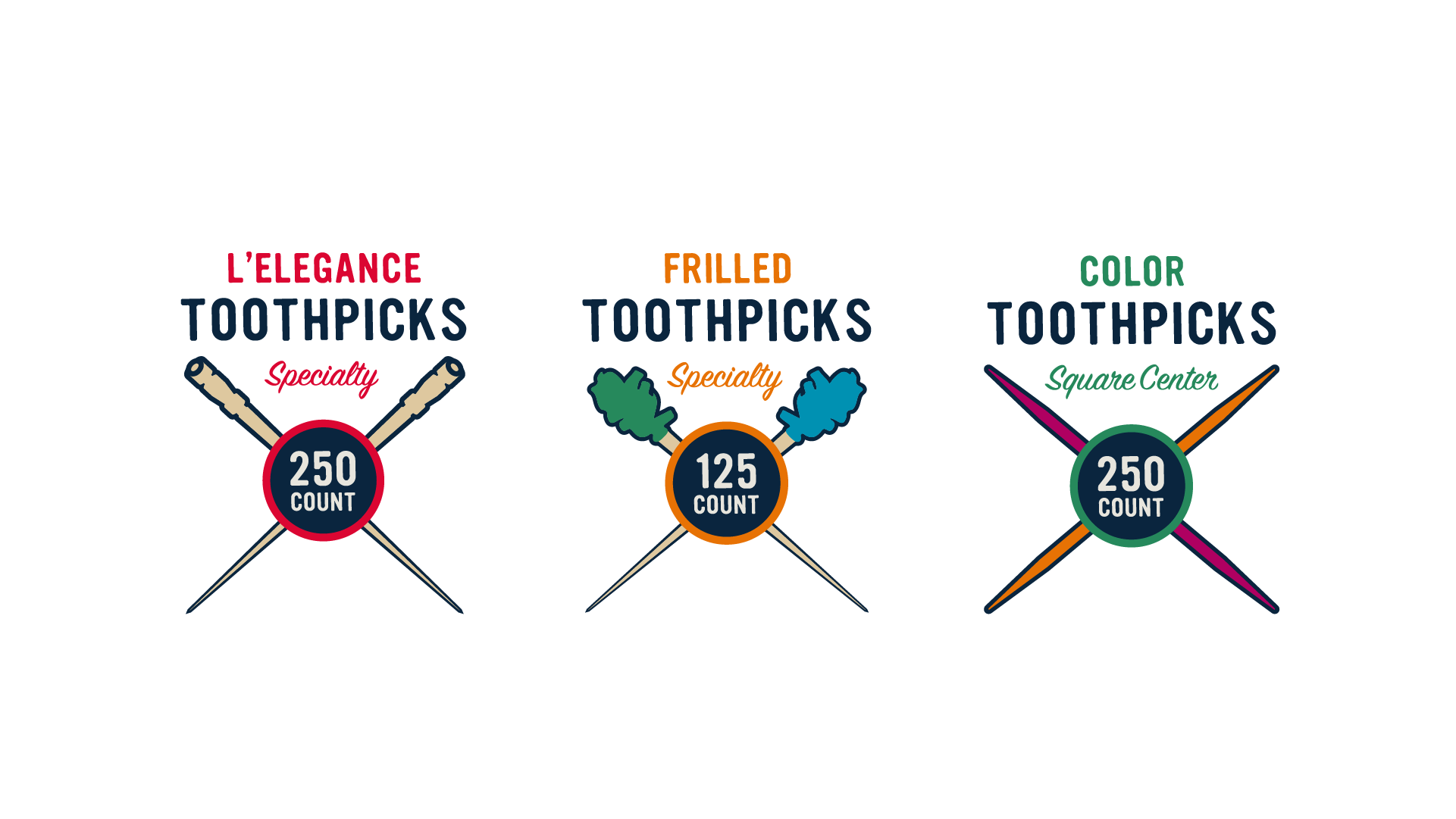
Lastly we established a common iconographic style to identify toothpick and match types and conveyed all label information in a common hierarchy so the consumer knows where to find relevant information no matter the product type.
In Conclusion
Our iconic, bold and thoughtful design approach embraces the timeless and trusted innovation of the Diamond brand while establishing a premium sensibility that promotes consumer confidence generation after generation.