JACK IN THE BOX
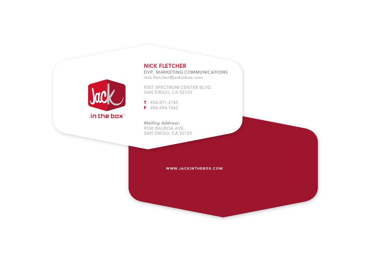
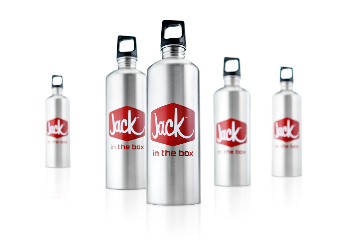
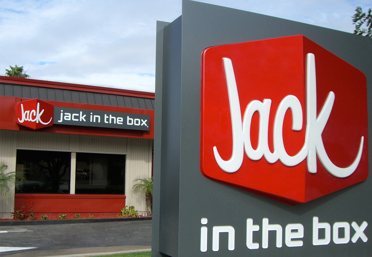
The new primary brand identity for Jack In The Box restaurants was designed to put a fresh face on an old friend. Acknowledging consumers’ verbal short hand and their love of the fictional CEO featured in the brand’s marketing campaign, the mark shortens the name to Jack. The simple script type was chosen to reflect the casual, fun-loving personal signature of the man behind the brand.
- IDENTITY
- VISUAL LANGUAGE
- BUSINESS SYSTEM
- ENVIRONMENT
- SIGNAGE

“Our new logo reflects how Jack In The Box has evolved. We’re upgrading our menu, service, and restaurants. Now, it’s time to upgrade our logo.”